Feature / Statement Lighting to Enjoy
I have been thinking about this post for some time.
Occasionally I see some post / article in one of my feeds that attempts to codify the 'best' feature or statement lighting fixtures ever. If you're interested in lighting, you've probably seen similar articles. I tend to finish reading with some sense of disappointment. Though I've come to realize this is all quite subjective and varies through the eyes of the beholder.
My own selections therefore will be just that - my own, not some definitive list that each reader will agree with or select from.
To begin, it might be best to discuss what I believe a Feature or Statement light fixture is...
By definition, Feature can mean 'a distinctive attribute', and Statement can mean a 'clear expression of something'. Make sense so far?
Near the beginning of each design project, I ask my clients if they wish to feature a light somewhere. I explain this might be that fixture that makes one smile or feel joyful. It might be that special purchase made, or perhaps a stunning show piece or timeless classic. Maybe its something handed down & cherished. I want to find a way to properly incorporate that into the finished design for their space.
Here is one example of something special that qualifies as a feature: Clients had gotten two post lights from a favorite city park (that had been replaced / upgraded), we converted them to pendants and mounted them in the entrance hall to their new home. A feature unlike any other home.
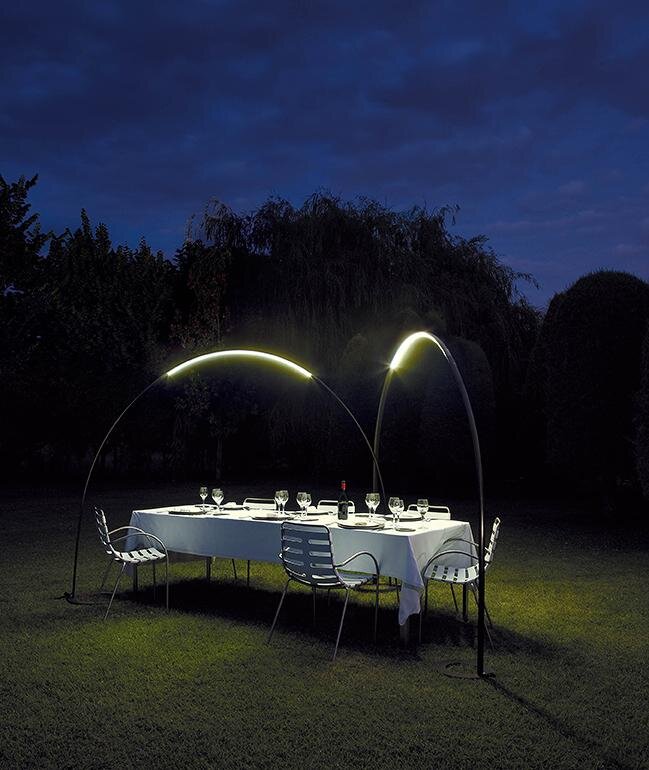
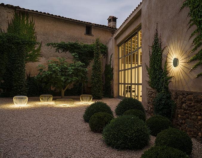
So, a selection of my current favorites that I believe to be special:
Each time I have the opportunity to suggest / install one of these (and other unique items I find) into a finished design, I get a great feeling knowing I'm incorporating something special for the clients!
What are your own favorites to feature, fixtures you consider special, something that makes a statement? Let me know in the comments.
Tiny House Lighting
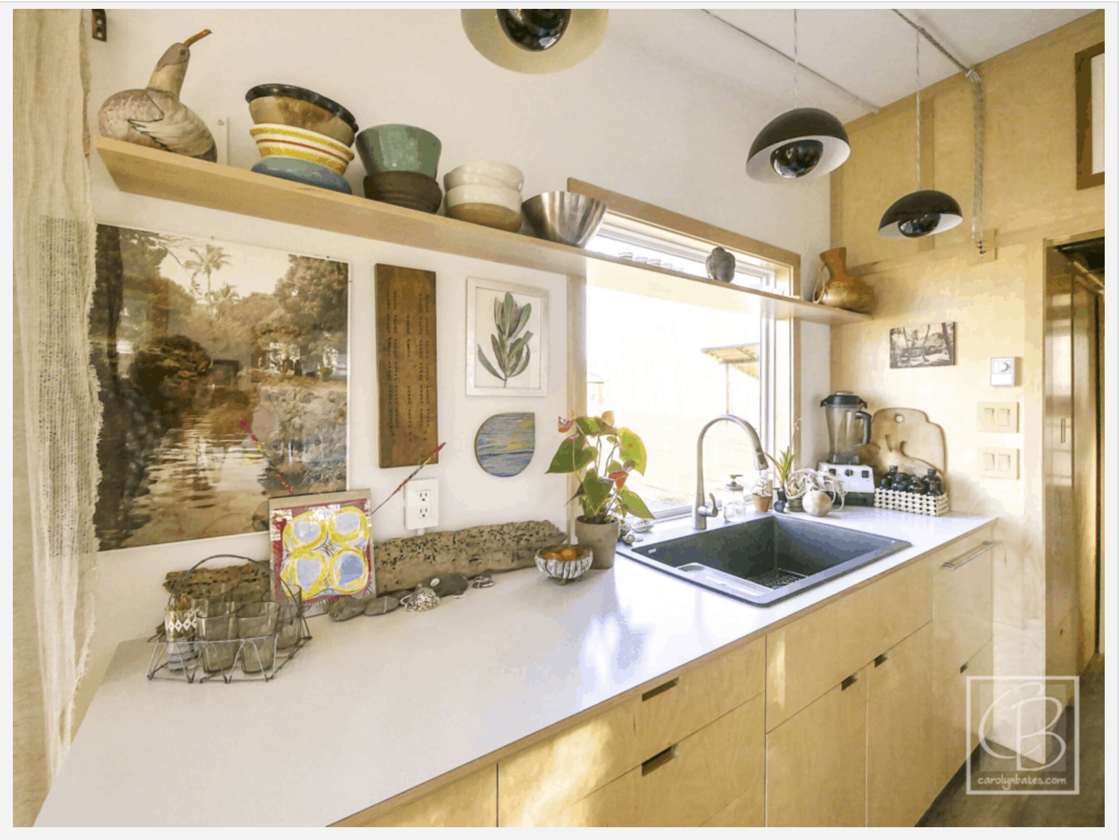
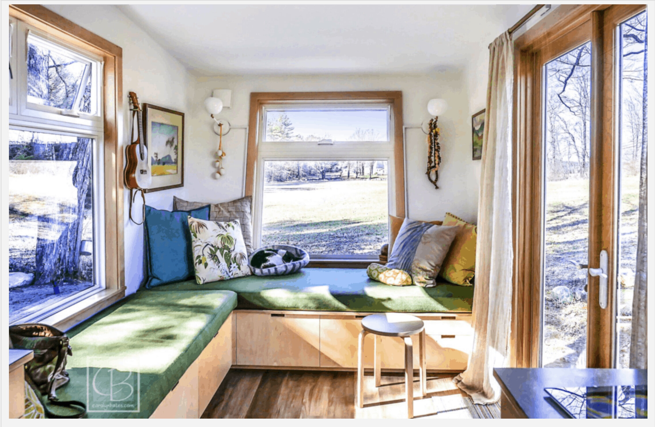
Prior to the first Tiny House Fest VT in 2016, I was hired to design a lighting layout for a THoW (Tiny House on Wheels) for Erin, one of the Fest organizers. There are now some images of the finished home. You'll see that just because the space is small, there is no need to skimp on style.
^ Outside, the small LED cubes over the deck provide up & down light without protruding past the roof overhang (so legally within limits for safe travel).
You can learn more about Erin & Kevin's THoW here. Listen to the podcast and view more images of this wonderful design.
All photos © Carolyn Bates Photography
Here are some additional ideas for lighting in Tiny Houses:
• LEDs are certainly the best overall way to light, as the most energy-efficient & power-miserly of currently available lighting technologies.
• LED tapes are thin and easy to hide, available in various color temperatures, tunable white, or in color-changing varieties.
• LED bulbs (for any screw-in type fixtures) from Cree, Philips, & Soraa are some of the best.
• LED 'wafer' (flat panel) fixtures give the look of a recessed fixture in 1" or less depth.
• Lastly, Kreon's Dolma fixture (a trio above) is an in-wall recessed fixture that can help to maximize THoW widths and stay within safe travel limitations. It can project both up & down lighting.
More New Project News!
I've been selected by the Windham Foundation to design lighting for the Turner Hill Interpretive Center in Grafton VT. This building is part of Vermont's African American Heritage Trail. While the Foundation continues their work on the Turner Homestead, the former Law Office (above, located at 31 Townshend Rd., Grafton, VT) serves to tell the story of the Alec Turner family and their part in Grafton's rich history. Alec Turner was an escaped slave who fought with the Union Army before settling in Grafton in 1872. He worked as a logger and sawmill worker until he saved up to buy 150 acres on a Grafton hilltop. There he built a home where he was to raise 13 children together with his wife, Sally Turner, a freed slave. His daughter Daisy tells the family's tales that line the Center's walls.
I hope to honor & enhance their story by bringing light to the Center for the first time.
Dwell - Good Reading
Recent work has been published by Dwell. Nice!
Happy to be part of a wonderful team of designers and trades that transformed an old VT barn into a high performance home. The architect chose to leave some of the barn's original elements within the existing structure, while updating finish materials and adding lots of windows for daylighting. With plenty of new wood lighting fixtures and many brightly painted surfaces, this home is warm, welcoming, and well-lit both day & night. This home appears in a larger article as the first of five barns & farmhouses that celebrate their roots.
Additional images may be seen in the Portfolio. All photos © Lindsay Selin Photography.
Exciting Project on the board!
Quite excited to be asked to collaborate on the design team for a church preservation / renovation / addition project!
Here is the early story of the project beginnings, of a local hero attempting to save a piece of history in her town. I loved reading about the early dreams they had for this place!
One portion of architect Robert Swinburne's initial thoughts on the project during his early design work:
"This is an old church begin turned into a modern home. My approach with this design is to minimally impact the large main space of the church. ... We are looking at a full height metal and glass separation from the large area of the church (from the residence addition) which will provide some acoustical changes, affect the heat distribution, lighting and provide a more intimate feeling for fewer occupants. Large sliding panels will allow this curtain wall to open up."
A short video made by the architect leading the design team, with glimpses of what the project will become!
^ We’re renovating this early 1900’s church…
...to this!
^ One of my early interior renderings of the view from the church’s main open volume to the new residence.
^ Here, the reverse view from the residence addition.
Further updates will be posted as it all comes together!
JLC's Energy Column - Good Reading
I'm pleased to be a part of the Energy column featured in Journal Of Light Construction's May issue, written by senior editor Ted Cushman. The column's focus is on 'high-efficacy lighting' and illustrates how code changes & LED technology improvements are coming together and making for some great lighting. A portion of my focus in the interview is that 'every project at every budget level deserves great lighting' and how 'we (as lighting designers) are free to design an entire house to use LED. That definitely has moved beyond what the 2018 code is talking about.'
You can download the PDF here.
Table Lamps Galore!
Along with my wife Robin, in our Mathiesen & Mathiesen Design partnership, we have just recently finished a photo shoot of Raku & Obvara (aka Baltic Raku) pottery table lamps & vases for ceramic artist Jenifer Morier @ LightenUpStudio.vt in Guilford VT. Jen is also on Etsy as JeniferMorierPottery.
Presenting here, a few of our favorite shots.
Raku is a type of Japanese pottery and Jen's works include crackle glaze, brilliant colors and hints of copper tones. Of Obvara, Jen says its "A centuries-old process where glaze-less pots are fired to 1650 degrees Fahrenheit then plunged into a fermented brew of flour, yeast, water, and sugar. Smells like burnt toast, in a good way."
I was able to consult on sourcing electrical supplies (cording, Edison bases, dimmers, etc.) The lamps are equipped with Cree & Philips LED A-lamp bulbs, most with dimmers, ready to dress up your tables for work & play!
Next up we're hoping to create sconces from new Raku pieces, stay tuned!
UPDATED June 2020: Jenifer has her Etsy shop online for purchasing. Please visit and check out her newest escapades into Saggar fired pottery, its fabulous!
Photometry
Photometry is the science concerned with measuring visual response to light, in terms of its perceived brightness to the human eye. Because the eye is a highly complex organ, this is by no means a simple task.
OK, that's a simplified definition, without the formulas & technical issues that drive the work.
Depending on your point of view, photometry is either the glamorous scientific side of a lighting designer's efforts to create great lighting OR the quite less-than-sexy work to make a design function correctly by providing the correct levels of light to meet a code or need. From either view, the resulting renders that are part of the engineering of photometry are both informative and cool.
Earlier this year I was asked to design an exterior lighting package for a restoration project of a city block in Bennington VT. Working with a design team of Stevens & Associates & the engineering firm of Dubois & King, we designed & engineered for public street entrances, rear building entries, two public courtyards and off-street parking & access ways. The final photometric renderings by Dubois & King illustrate the results beautifully. Bright entries that beckon you to approach & provide abundant safe lighting at sidewalks & steps, courtyards that invite you to hangout & relax in them, and parking with a relatively even wash of light. This was another wonderful collaboration, very happy to be a part of the teamwork!
Lighting The Way: Four Good Reasons Why You Need A Lighting Designer
Linking here to Stratton Magazine’s Fall 2017 issue with an article by Anita Rafael that I’m featured in: "Lighting The Way: Four Good Reasons Why You Need A Lighting Designer”. Please let me know what you think! It was a pleasure to be part of this and I am looking forward to a visit some day with Susan Brady @ SBLD Studio Architectural Lighting Design, the other designer featured in the article.
What Makes Good Lighting?
I begin with a caveat - This is an opinion piece.
First, I'd like to define what I mean when discussing 'Good Lighting'.
Good Lighting is timeless and long-lasting, it's innovative, it's unobtrusive, and it's environmentally friendly.
Good Lighting provides joy, safety, wellness, personal expression, unique character, and highlights detail in our spaces and in our lives.
Good Lighting creates a positive visceral response.
Before proceeding to work on any lighting design, the program (or concept) of the project is required for an understanding of the well-defined wants and needs of our clients. Good Lighting Design issues that then need to be considered include: What are we lighting and where to place light; What type luminaire (fixture) and lamp (bulb) to use; How to control it.
Ok. What makes Good Lighting?
There are a few key elements that will apply no matter what style is chosen and no matter the size or budget of a project.
• Create layers of light. Spaces are used in a variety of ways, the lighting should be flexible to allow that. Mixed sources will allow selections to be set to changes in mood or use.
• Use direct & indirect light. Work areas want quantities of task light directed to the surfaces. Ambient light gets washed or bounced off various materials.
• Incorporate shadow & asymmetric pattern. These are needed to provide contrast in a space. With that, we can appreciate the features, textures, and decoration.
• Hide the light source. Glare is the nemesis of good lighting. The trend to using bare bulbs is over-rated, and old-tyme-y edison bulbs do not provide enough quantity of lumens to be useful. More about this in a future post.
• Utilize advanced controls. In the simplest form, a dimmer instead of a switch. Perhaps add control of certain lamps via a smartphone app. A fully programmable & integrated system in a more extreme sense.
• Include a 'feature'. This can be that fixture that makes our client smile or feel joyful. It might be a special purchase or a cherished hand-me-down or show piece luminaire. Got ideas of your own about what makes Good Lighting? Please let me know, I look forward to hearing your thoughts.
Houzz.com, Thanks again!
From Houzz.com..."We're writing to let you know that you've been voted by the Houzz community as a winner of our Best of Houzz 2017 award! You can read the full press release here. Your work won in the Design category, as your portfolio includes some of the most popular images on Houzz in 2016."
Tiny House Festival VT Followup
As some may have noted from other postings, I was asked to give a presentation on Lighting & Interior Design for Small Spaces at the first Tiny House Festival VT in Brattleboro VT this fall. Here now, a copy of the talk I gave. I'm pleased with the message, & the reception from those in attendance, even while being somewhat rushed on time. While this AV edit is a bit rough, a hat tip & many thanks to BCTV for all their efforts under unusual conditions that day. I was also fortunate to be followed by Lina Menard of Niche Consulting, a tiny house design consultant from Portland OR. Another great take on tiny house design! Both talks have great information on design, no matter what size you're considering. Shout out to the festival organizers for a job well done. Onward to THFVT 2017!
What does that mean?
I am a Lighting Designer.
What does that mean (at least to me) and how could it benefit you?
As a lighting designer, much of my work is in 'atmosphere design'. In part this means planning how spaces (and the objects within) get illuminated & accentuated, about setting the tone or mood, and working at addressing the needs of the inhabitants & visitors. Mine is a collaborative design practice. It always revolves around you as the client and often includes Architectural Designer, Interior Designer, Landscape Designer, and Electrician. Like these professionals, I have years of educational and project experiences to bring to bear on any design challenge. I believe an added bonus for me is years of work in the entertainment arena (dance, opera, theatre, music concerts, and touring) which give me a bit of a different perspective. How we go about manipulating light and dark, incorporating day-lighting and shadow-play, choosing fixtures & materials, considering your (the client) personal choices, and the ‘big picture’ and overall design aesthetics are all elements of a successful project with an outcome you'll be pleased with for generations to come. Good Design is timeless.
Like many of the design team members mentioned, I work through a number of design phases covering everything from initial concepts to occupancy.
During design development I'll work on possible inclusion of the latest technologies to keep the project as current / future-ready as possible; I'll research best available lamping and use of color & tunable white lighting (more on color & tunable white lighting options in a separate future post); I'll consider any light (and sound - yes, some lighting emits sounds) sensitivity you may have; and we'll look at the overall style aesthetic for the spaces.
Further along the design path we'll have plenty of opportunity for dialog about what the lighting design / layout is going to accomplish, how the layering of light in the spaces will look, and about actual fixture proposals.
During design documentation I'll refine the fixture proposals, create the final design / layout and a fixture schedule to be used by the electrician to make fixture purchases and installation. The layout will specify fixture & switching locations, dimming functions, specific lamping for fixtures, applicable smarthome technologies, etc.
In the actual construction phase I work to address any electrician / contractor needs. As the project reaches completion, I'm available to work on a final focus of any adjustable lighting included in the project so that the design elements are fully realized as you move in. I also like to review the project objectives and get client feedback after you have settled in to your new space.
Everyone deserves good design and great lighting.
Please be in touch. Onward!
Technically Minded
Two very thoughtful technical articles linked here. Good reference material and additional resources.
The first an open letter from Jim Benya, where he "... urges the lighting community to focus its attention on LED lighting quality, lest a dangerous precedent be set that ignores color temperature and makes way for glare in the name of energy efficiency."
The second on new color rendering metrics and technologies that can only make our lighting design practices better.
Shadow - An Elemental Component of Lighting
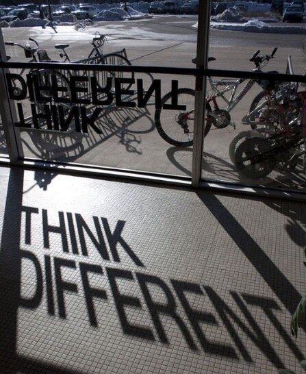
Yea, its impossible to escape the need to address shadows when talking about lighting. Contrasts, the difference between light and dark, are what provide depth and visual interest to the spaces we inhabit. The dark / shadow-y element is often taken for granted. When our focus shifts to the form & character of shadows we can appreciate their incredible beauty and graphic qualities. This post will go beyond examples of any everyday normally lit spaces that display the contrasts well... straight to extremes that are fun, that are pushing the boundaries of projecting shadow & light, and that display superior shadow-play by every measure!
Cool Shadow-play at normal scale, with practical application:
^ Calabarte makes lamps from carved gourds. 3D printed.
^ Lacelamps by the artistic duo Linlin & Pierre-Yves Jacques. Projecting delicate lace patterning to surrounding walls. Who needs wallpaper for texture when you can have this!?
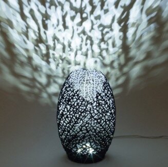
^ 3D printed lamps by Nervous System include Hyphae, like veins of a leaf, or coral growth.
^ Peter Pieroborn makes the Plumb light sculptures from yellow cedar, red cedar and mahogany.
^ Finnish designer Kirsti Taiviola displayed ‘illusia' at Lux Craft exhibition in London UK in 2011. This pendant lamp features a fine, almost invisible texture on a handblown glass ball hidden in the lampshade, which creates a blossom-shaped projection of reflections on surfaces below. With three different levels of light intensity, the visibility of the reflection can be adjusted so the lamp can serve both decorative and illuminating functions. More examples of shadow-play at her link.
^ hutch studio produced this beautiful pendant of folded paper houses, casting some cool shadows on nearby surfaces! It is comprised of 33 paper houses made from vintage 50's cookbook pages. They hang with thread from a spiraling wire support.
^ Vibia's Meridiano stool / footstool / table can work indoor or outdoor. Design by Jordi Vilardell & Meritxell Vida.
Daylighting Shadow-play on a slightly larger scale:
^ LZF's Paisley screen was created by the Spanish designer Luis Eslava.
Additional Goodies to enjoy:
^ Created by mixed media artist Anila Quayyum Agha, this elaborately carved cube with an embedded light source projects a dazzling pattern of shadows onto the surrounding gallery walls. Titled Intersections, the installation is made from large panels of laser-cut wood meant to emulate the geometrical patters found in Islamic sacred spaces. Learn more here.
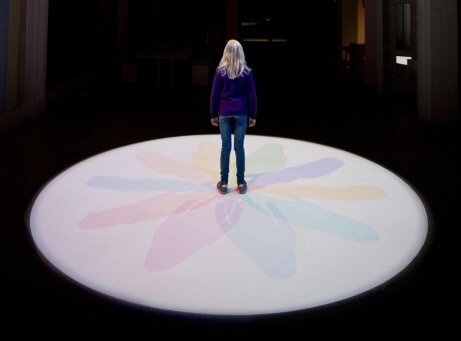
^ Shadows do not always have to be dark, they can take form in beautiful color! Starting as a simple circle of white, when one enters the light breaks like a prism.
^ Ripple, by Poetic Lab. When a beam of light projects through the gently rotating mouth-blown glass dome, shadow and light form a breathtaking, ever-changing pattern. Perfect for a spa or relaxation space, right?!
^ At the Museum of Science & Industry in Chicago US. Focus Lighting uses spotlights shooting 60 feet down through large liquid-filled disks, projecting ripple patterns on the floor to allow exploration of liquid wave dynamics. OK, not something you'd have in your sitting room, but cool just the same!
For additional inspirations, check out more examples at my Pinterest. Add a comment with any great shadows you've seen or experienced.
Worthy News Items
Two important and interesting items are in my feeds today, and are post-worthy here.
First up (shown above), a possible first-world solution to a third-world issue... GravityLight 2 is campaigning for funds to create jobs, manufacture, and bring LED light into the lives of many millions of people. GravityLight 2 IndieGoGo vid. From the campaign information... 'As well as designing GravityLight to provide a clean, safe and affordable alternative to kerosene lamps, we also want to create local jobs, skills and livelihoods for those who make and sell GravityLights.' This is a brilliant idea, deserving of our consideration, and our backing.
One the other hand, something inspirational & thought-provoking without an actual product...What Is "Design Fixation," And How Can You Stop It? The Premise - Your first design solution may not be the best. The Advice - Explore options, dig deep, get creative, look for multiple design solutions early. From the folks at LifeHacker: 'As design blog Fast Co. Design explains, money, time, or ego might make someone stick to their first idea, even if something better comes along. While creativity is an iterative process, you can bypass the tunnel vision that comes from focusing on a single idea by generating multiple ideas at the start. It helps even more if you can bring other people into that process to help challenge your ideas or offer alternative input.' This re-enforces a team approach, a collaborative process, and working less in isolation. I have long been an advocate for all that.
Bravo! Both Brilliant! ideas. h/t to both Gizmodo & LifeHacker.
Big & Beautiful! Large scale lighting at its best!
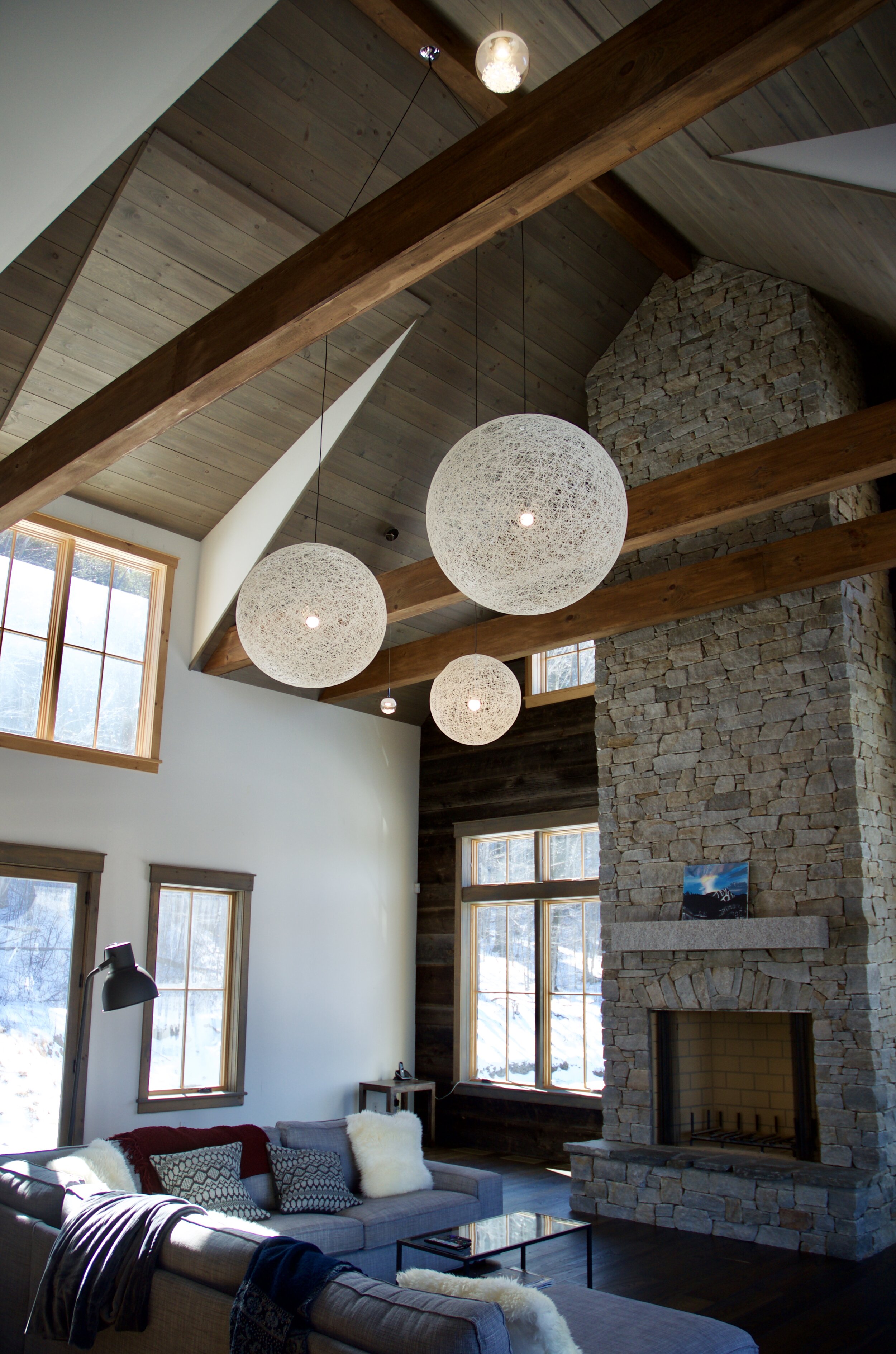
Let's face it, large scale light fixtures can often be stunning. This post will concentrate on some personal favorites, fixtures to find a home for (if I'm lucky enough to get to design spaces where they work well), and the ins & outs of what goes into successful large scale fixture design.
Let's begin with an outdoor piece shown above. FoxCat Design makes the NI Parasol. Three channel lighting system with individual one-touch dimming give plenty of looks to this piece. Plus it can be customized by the fabric color used. The down-light ribs uses color temperature of 1800K LED candle light colour making it easy on the eyes at night time. The up-light ribs uses colour temperature of 2200K warm light color. The parasol can even be lit while closed to provide a 'torch-like' light to the surroundings. This is a red-dot design award winner from 2014 .
Moving inside now. Large domed and drum shape lights have been around for ever. However, getting them right so glare from exposed lamping isn't an issue is a design challenge. Below are a few designers who met that challenge head-on.
^ The Super Gea from LZF is one fine example, by Spanish designer Marivi Calvo. This lovely is a perfect 'clean lines' minimal approach to lighting a space, and its available in 9 wood veneers to make it easy to match with various color schemes. This has a bottom diffuser to hide direct view of the lamping. Simple and effective.
^ Another LZF item, the Spiro SG by designer Remedios Simón is a bit larger than the Gea and uses a pattern of various wood circles to diffuse the light source. You should be able to find this in a variety of word & color combinations.
^ Here is an example of a design that makes no bones about the source, but almost celebrates it. Called the Hatchlight, its part of a commissioned installation in a series of Paris restaurants, by Studio Robert Stadler. The glare is minimized using a 'silver-tipped' lamp (where the silver coating hides the filament from direct view and re-directs the light in this case back up into the bowl of the fixture). Plus the hand applied lining makes each lamp unique. There is a great projection of patterns to the floor from this dome. I also like the tight cone of light and how as one moves through the space there would be this dynamic movement in and out of these illuminated pools. I have my eye on a similar fixture on Etsy available to purchase.
^ Here is the direct opposite of the Hatchlight... Paul Cocksedge's Capture, is a hand-spun aluminum dome that holds a glowing white light. The hollow 5 ¼ foot piece is more or less a lighting fixture, but all of the infrastructure that you normally associate with lights are invisible. The wiring, bulb and electrical cables are hidden away, and instead viewers simply see a flat, white light that appears captured by a film across the base of the dome. The opening of the dome is actually empty and the light source is totally invisible, which creates a trippy effect that leaves you wondering where the light is coming from and where it’s going. “I didn’t want to see the light source, what I’m interested in is light itself, just light” Cocksedge says. “I was trying to create an object when you look up into it, there’s absolutely nothing there apart from light.”
^ On to another projected piece on a grand scale... Focus Lighting designed lighting for the Science Storms exhibition in the Museum of Science & Industry in Chicago IL USA. Seen here, spotlights shoot 60 feet down through large liquid-filled disks and project ripple patterns on the floor to allow exploration of liquid wave dynamics.
Materials also play an important role in successful large-scale lighting. Typical metal and glass can be augmented with or replaced by wood, silk, plastics, felt, etc. in fascinating ways. A few examples below…
^ “Soundless” by Ola Gillgren, felt
^ Ending now with lighting on the grandest of scale! The ºXXL(amp) by Bart Lens, for edendesign.be is essentially a flattened dome, inspired by the shape of a Chinese lantern. The twelve-segment construction makes the connection with the lantern, but a pumpkin perhaps comes to mind, or a hot-air balloon.
Interested in seeing more like these? Hit the link to browse my Pinterest.
Architectural Trendspotting: Negative Space
Some time ago I came upon this story of the House In Fontinha (shown above) and was intrigued by the 'cutout' entrance. The simplicity of negative space creating an entrance is not seen in run-of-the-mill design. That image got tucked away for future reference... Now is that time. Recently my feeds have shown a series of similar spaces based upon the absence of structure. The engineering on display ranges from simple to complex, the results are always eye-catching.
Many are entrances, some include room for a car, a few become enclosed deck space (where lack of structure allows enhanced views).
Modeling for Purpose & Communication
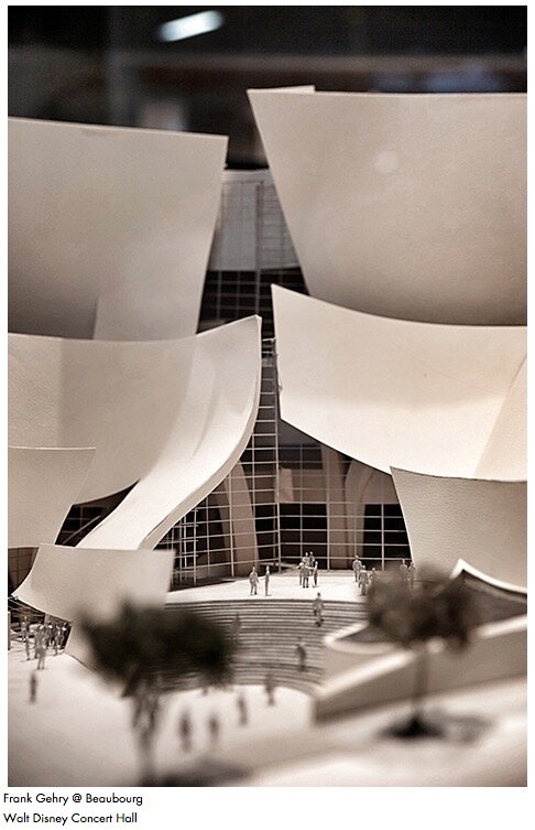
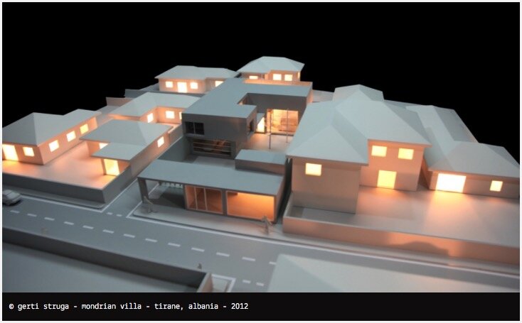
Some architecture professionals, and those of us in related design fields, may lament the demise of architectural model making. In fact, the clients we work with might too (though they might not know what great things they're missing). This collection of images (and the sites/posts they link to) will indicate otherwise. Model making, and its ability to communicate effectively, is alive and well (if perhaps not employed often enough!). All too frequently in the digital age, its often easiest to create an on-screen representation and leave it at that. In 3D, its possible to more effectively communicate the design, as well as review any aspect over and over or from a new angle. Architectural study models are often done quickly. Their purpose to aid in design work on massing, spatial relationships, scale, interaction of volumes, etc. A presentation model is one shown to a client. It is a skillfully crafted & meticulously scaled model of the proposed structure.
Enjoy a look through this group of physical models...
A model can allow us to view through...
... or can show plan and section views together.
A model can communicate movement...
...and sense of scale.
I often prefer models that are lit, for the extra detail they can provide.
Model making can also be a colorful or whimsical obsession...
...and can even be done at full scale!


